amigo
A friendship-rooted brand designed to empower creators through collaboration, storytelling, and commerce. This project transformed an emotional concept into a scalable brand and digital ecosystem.
Role
Creative Designer | Co-Founder
Industry
Branding
Duration
8 years

We are amigos
Imagine two friends (co-founders) who came together with shared passions—design, entrepreneurship, community. They built something small, but meaningful: creating designs, helping each other, lifting each other up. That friendship became the canvas for Amigo.
Over time, what started as helping one another grew into helping others: other artists, designers, small-business people. Because Amigo believes that when you foster connection, you multiply impact.
This origin story should be live, honest, showing the ups and downs: how support of a friend helped in failure, in pivoting, in learning, and how that’s something Amigo wants to echo in every customer, partner, and collaborator.
Values / Brand Pillars:
Authenticity – real voices, real stories, flaws included.
Community & mutual support – both giving and receiving help.
Creativity & craft – design matters, attention to detail.
Growth & empowerment – helping people grow, especially small creators or businesses.
Connection over transaction – sale isn’t everything; relationship is central.
Brand Journey & Customer Touchpoints
Design the customer journey so that it reinforces the friendship / connection motif.
Awareness
Content: stories of friendship, collaborative creation.
Channels: social media, word of mouth, blog, podcast episodes of founders interviewing amici (friends, collaborators).
Visuals: imagery of two people creating together; collaborative art; behind-the-scenes.
Consideration / Engagement
Free or low-barrier content: e.g. design guides, capsule interviews with small business owners, community forums.
Interactive social posts (“tag your amigo who…”, co-creation challenges).
Newsletter with stories of friendships, creative process.
Purchase
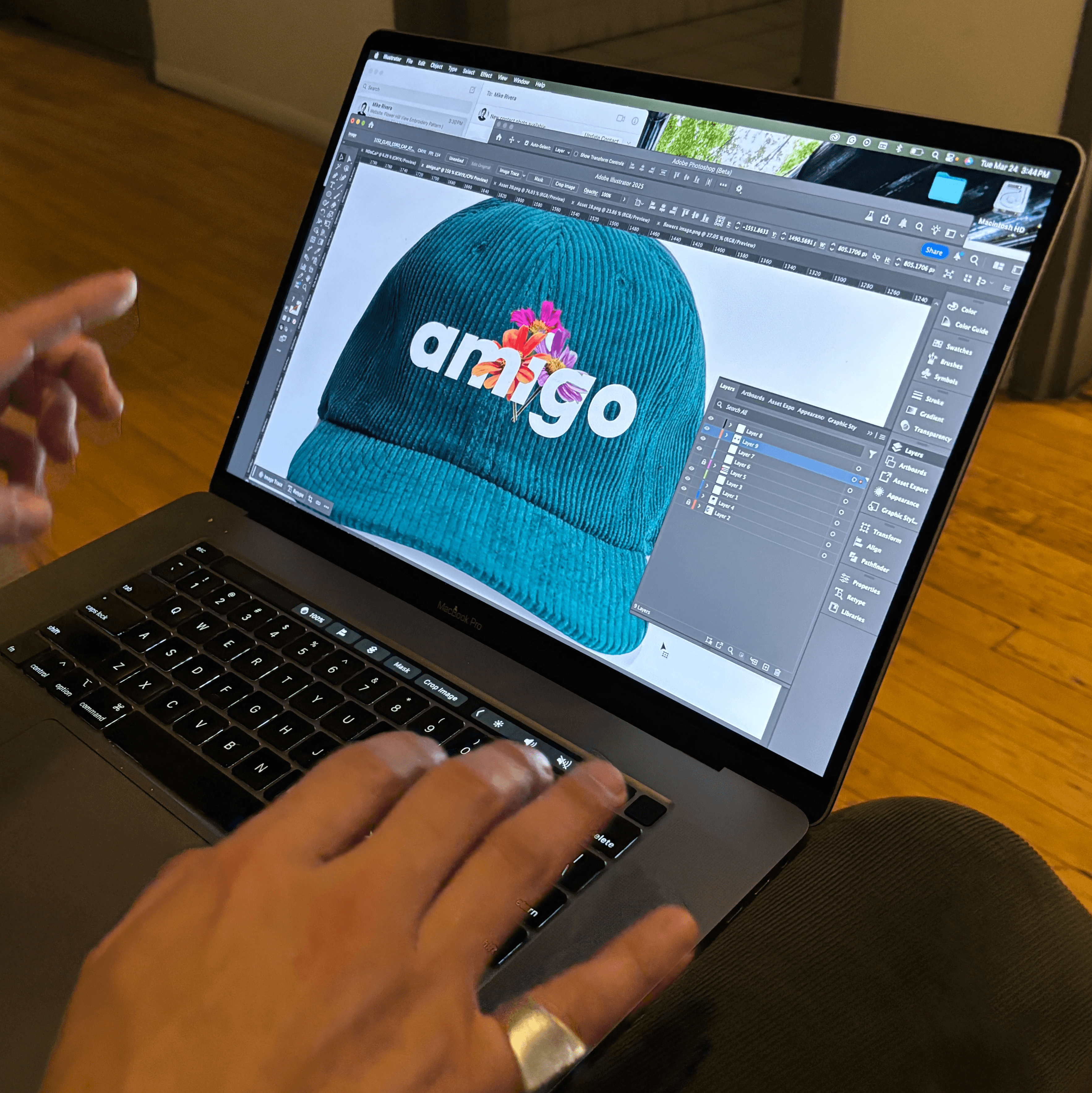
Merchandise that’s meaningful: designed, high quality, visually communicating friendship.
Limited edition drops, perhaps co-designed with “friend” storytellers (artists, customers).
Packaging includes a personal note / story snippet; perhaps a “share your amigo story” insert.
Post-purchase / Loyalty
Invite customers to share their stories of friendship, their business, their creativity.
Spotlight user-generated content.
Rewards / community benefits: e.g. early access, co-creation opportunities, maybe even mentorship (see later).
Advocacy
Customers become ambassadors.
Referral programs (“bring your amigo”).
Testimonials and stories of how Amigo helped their venture or friendship.


Marketing & Storytelling Strategies
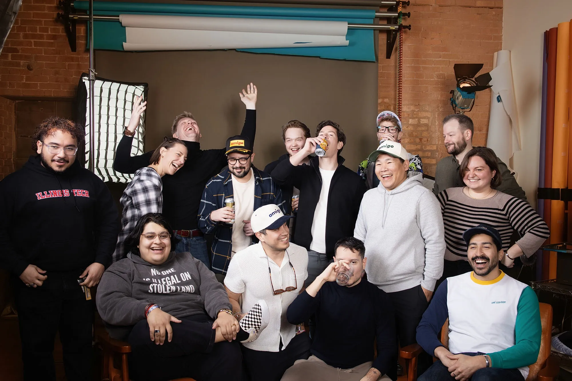
Content series “Amigo Stories”: monthly features of two people/friends/collaborators who are doing something together (artist + friend, siblings doing a business, etc.). The story focuses on how their connection mattered, what they built together.
Co-creative drops: collaborate with guest artists, small brands, or even customers (“Amigo x Friend Name”) to produce limited pieces – say one design contributed by the friend, another by Amigo, tied together.
Social media / community challenges: e.g. #MyAmigoChallenge where people share something they and a friend created, or did together.
Educational content / how-tos: especially targeted at people who want to build a business / brand, e.g. “How me and my amigo started this business”, “Lessons from building together”, design & branding tips from the Amigo studio.
Events / pop-ups: real-world (in Chicago, or wherever) meetups with customers and collaborators; maybe co-work days; or online workshops.
Merch drop teasers & storytelling: before each merchandise drop, tell the story behind the design—why it matters, who designed it, how it connects to friendship.


Brand Voice & Visual Aesthetic
Tone of voice: Warm, sincere, conversational. Sometimes playful, sometimes reflective. Always personal (“I / we / you / amigo”).
Visual(s):
Two-person motifs: interlocking shapes, dual colors, mirror imagery.
Natural / earthy tones mixed with bold accent colors to denote energy and connection.
Rough / hand-made textures, sketches, brush strokes: signaling authentic craft.
Logo / Branding elements:
Possibly two entities or shapes forming an “A” or stylized connecting lines.
Icons that evoke sharing, connection, handshake, interlock, etc.
Visual & Tone Notes
Colors: Warm neutrals (sand, cream, soft brown) + accent orange or sky blue (friendship energy).
Typography:
Headline: Sans-serif
Body: Clean serif
Mood: Human, handmade, inviting.
Photo style: Documentary feel, candid over polished.
Other projects

Chicago Knife Center
A digital experience built for professional chefs, Michelin-star restaurants, commercial knife rental clients, and walk-ins — focused on speed, trust, and precision.

Dallas Flash Pickleball
Designed Dallas Flash Pickleball’s first digital experience to rally fans, players, and families. The goal? Build hype, sell merch, and create a flashpoint for community engagement.

A Wilder Experience
Designing an end-to-end brand experience for adventure enthusiasts — a seamless booking platform for long-range traverse expeditions

North Shore Language Atelier
Revolutionizing the educational ecosystem with a web development to enhance interactive learning collaboration.

Morning Drop Off Club
To turn the everyday school drop-off into a doorway for human connection — building communities one hello at a time, and raising kids who see what real citizenship looks like.